Brand identity logotype with custom ligature on cream paper
Poster color collision — electric orange meets deep indigo
Packaging foil stamp catching directional studio light
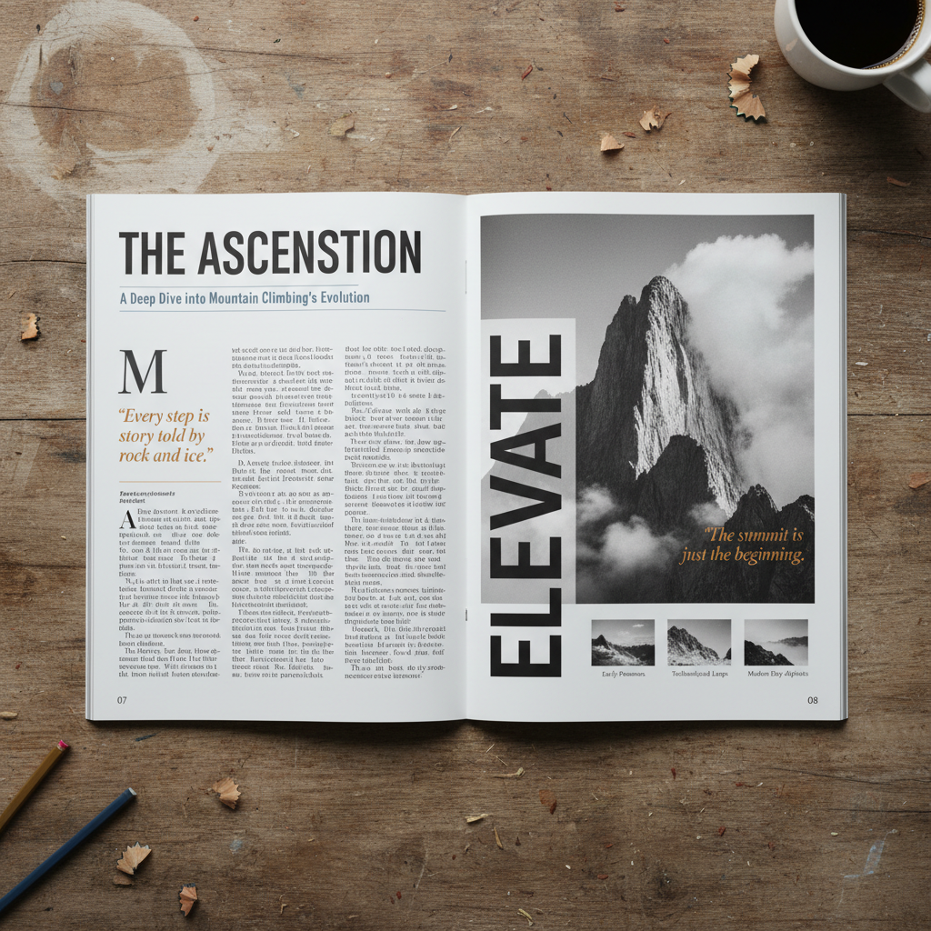
Magazine editorial spread — typographic hierarchy study
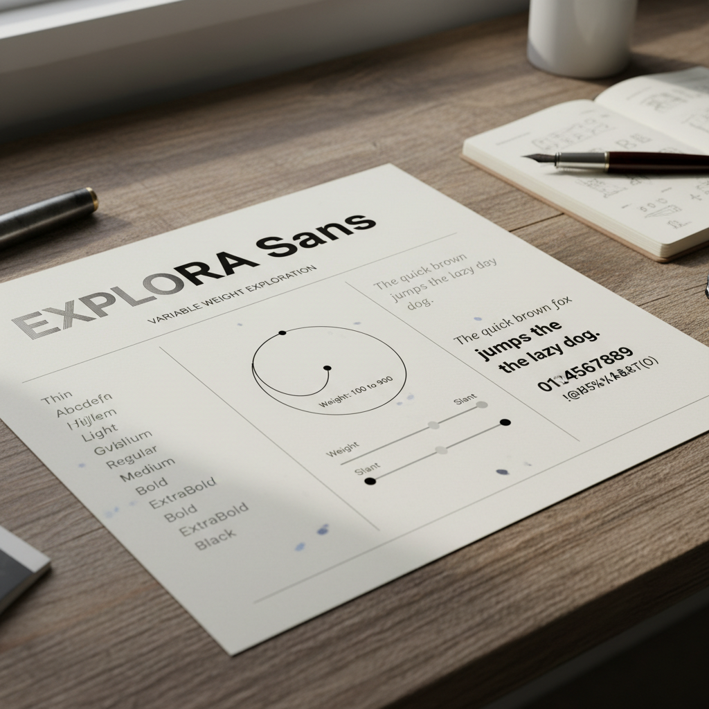
Type specimen sheet — variable weight exploration
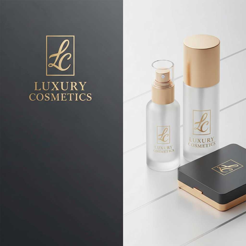
Brand color swatch palette — luxury cosmetics identity
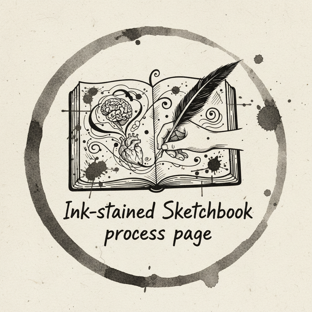
Ink-stained sketchbook process page — logo iterations
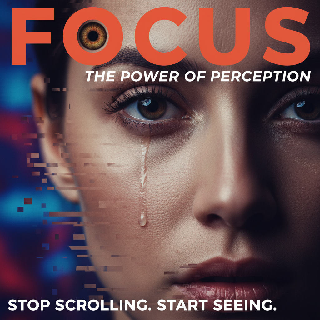
Magazine cover — bold crop stopping the scroll
Scroll
Brand IdentityEditorial DesignPackagingType SystemsArt DirectionMotion GraphicsBrand IdentityEditorial DesignPackagingType SystemsArt DirectionMotion Graphics
01 / Brand Identity / 2025

Forma Studio

Brand Identity & Type System
The Brief

"We needed something that felt architectural without feeling cold. Something that would look as right on a business card as it would on a 40-foot hoarding."
Forma Studio, NYC
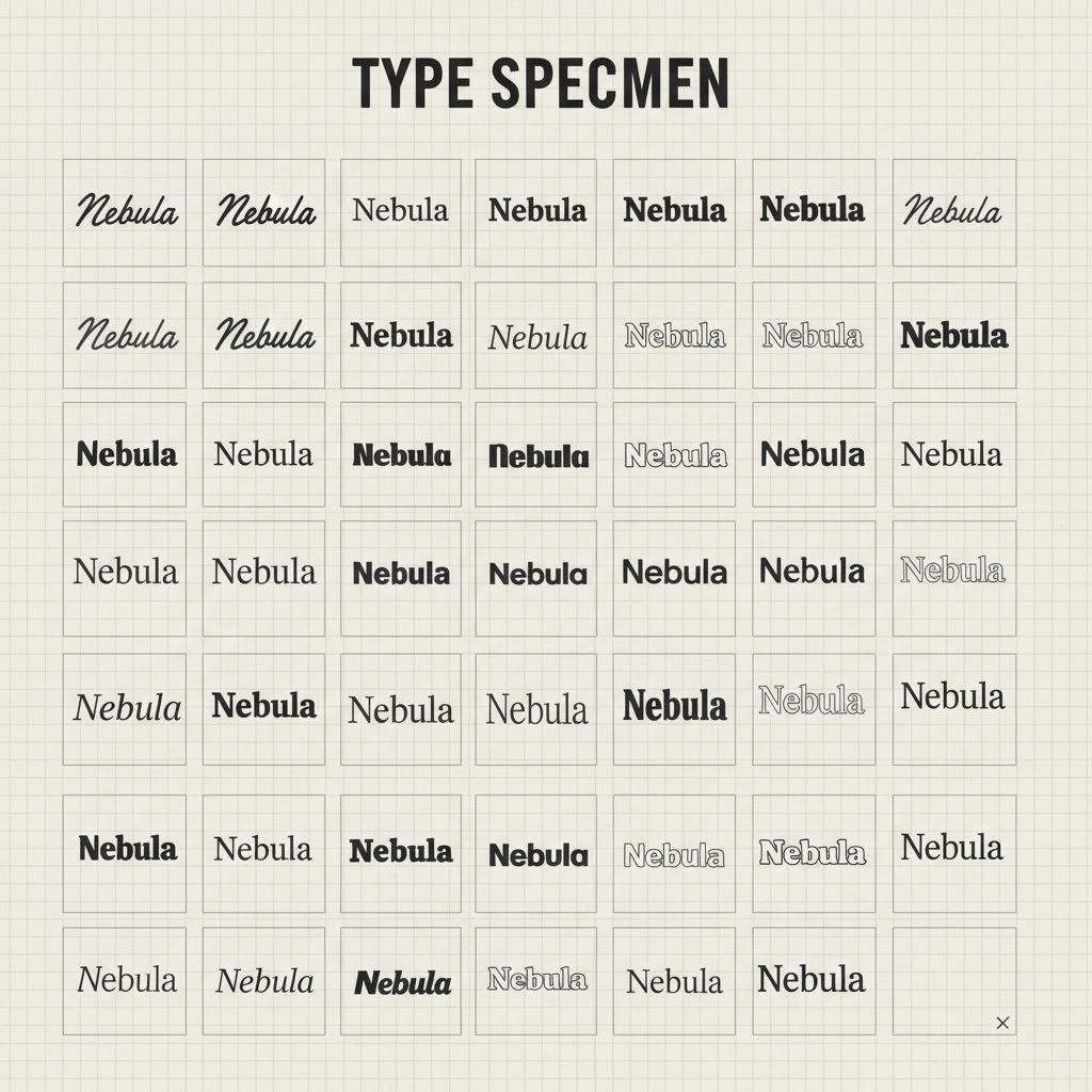
Type specimen sheet showing 47 logotype iterations on grid paper
Type Exploration — 47 iterations

Six weeks of letterform surgery. Every weight, every kern, every counter explored until the mark felt inevitable.
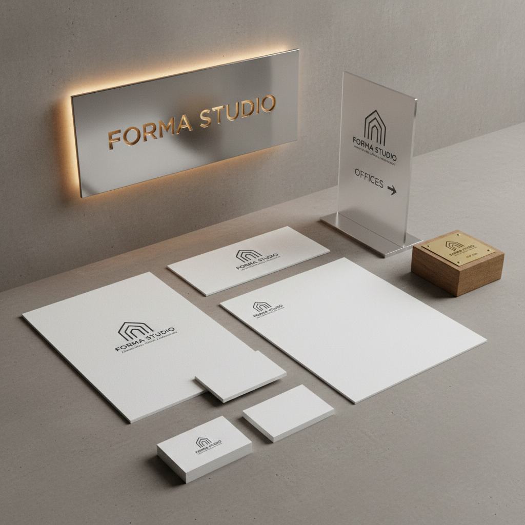
Forma Studio brand identity applied to stationery and signage system
+340%Inbound inquiries in 90 days post-rebrand
02 / Editorial Design / 2025

Vantage Magazine

Cover Art Direction & Layout System
The Brief

"Our last three covers got lost on the shelf. We needed someone who understood that a magazine cover is a 0.3-second argument for why your thumb should stop."
Vantage Media Group, London
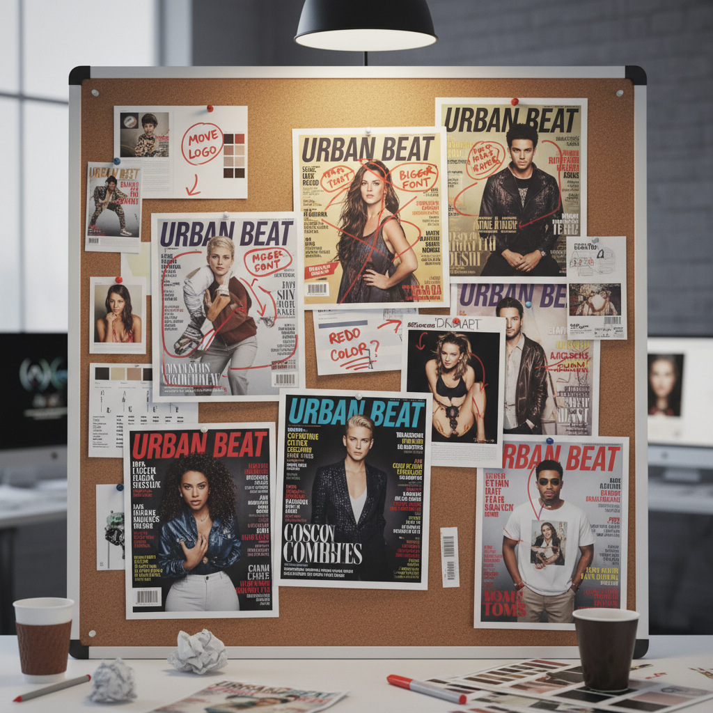
Pinboard of magazine cover proof iterations with red marker annotations
Cover Iterations — Issue 14

Twelve cover directions. Tested at actual newsstand scale. The final crop was decided by covering half the page with a hand.
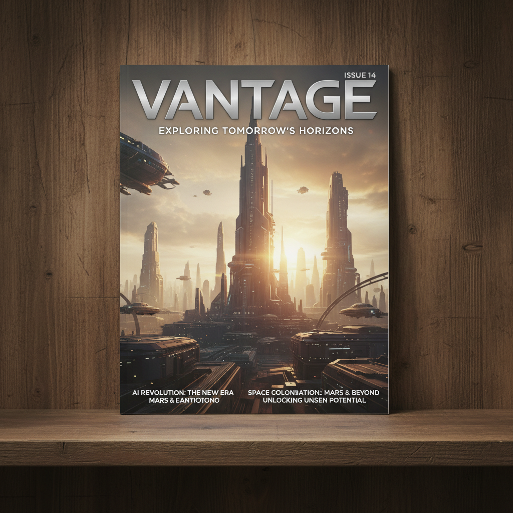
Vantage Magazine Issue 14 cover displayed on newsstand
2.4×Newsstand sell-through vs. previous issue average
03 / Packaging & Identity / 2026

Brûlé Spirits

Full Brand Identity · Packaging · Campaign
The Brief

"We had a world-class product in a generic bottle. We needed packaging that would make a buyer reach past every other bottle on the shelf — before they even read the label."
Brûlé Spirits, Austin TX
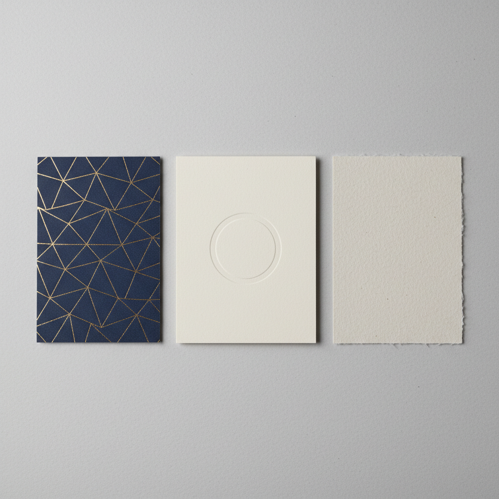
Packaging material samples — hot foil, deboss, and uncoated stock swatches
Material & Finish Studies

Three months of material research. Hot foil stamping, blind deboss, uncoated stock. The label is a tactile event before it is a visual one.
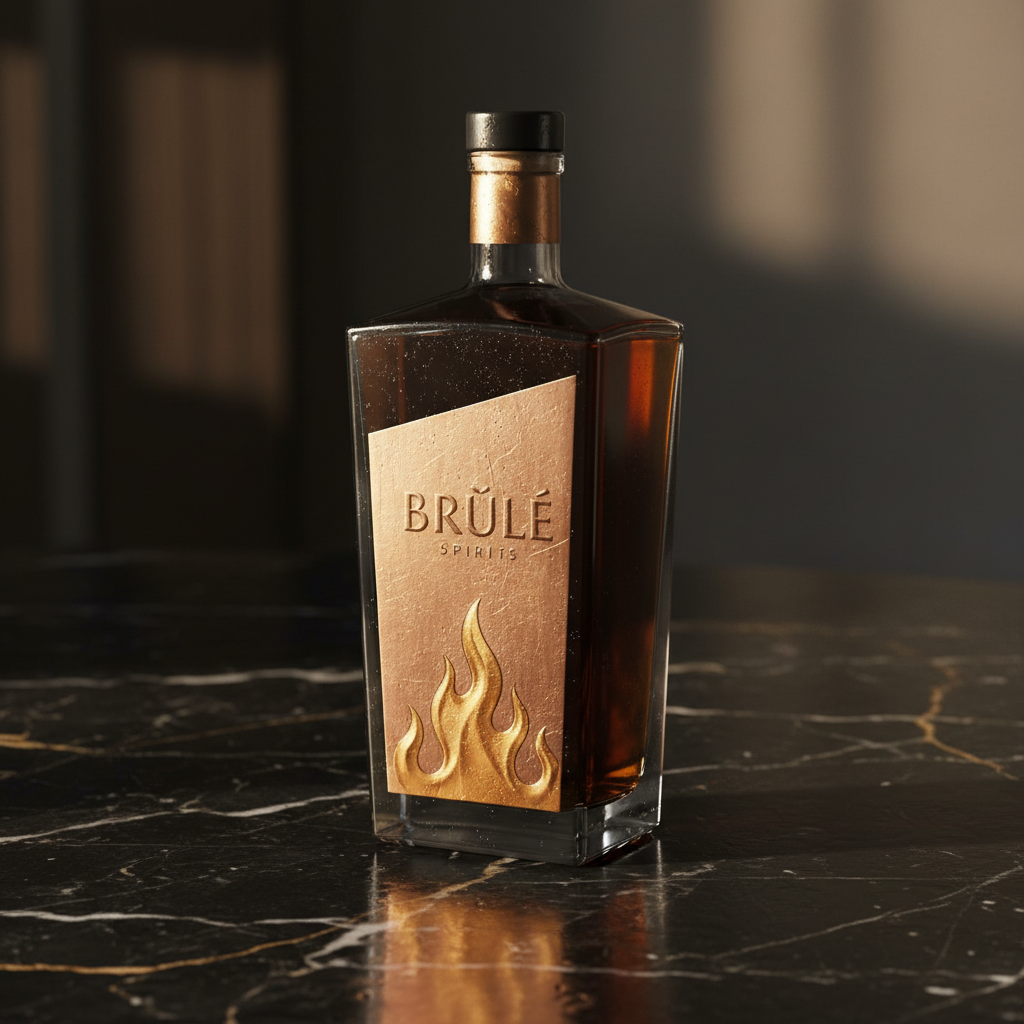
Brûlé Spirits bottle with foil label on dark marble surface
$2.1MSeries A raised within 8 months of brand launch
47Brands Built
12Magazine Covers
3Design Awards
$18M+Client Funding Raised Post-Rebrand
Who I Work With
Creative AgenciesFreelance augmentation
Funded StartupsSeed to Series B
Editorial TeamsPrint & digital
Luxury BrandsPremium positioning
Featured In
It's Nice That
AIGA Eye on Design
Print Magazine
Creative Review
Available for projects starting April 2026
Not Ready to Commit?

Download the Case Studies

All three projects — Forma Studio, Vantage Magazine, Brûlé Spirits — as a 28-page PDF monograph. Process notes, rejected directions, and the final numbers.

No spam. One email. The PDF. That's it.